Edit chart
Loading graph
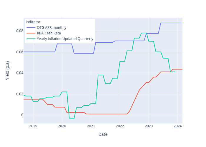
Trent0099's interactive graph and data of "Yield (p.a) vs Date" is a line chart, showing OTG APR monthly, RBA Cash Rate, Yearly Inflation Updated Quarterly; with Date in the x-axis and Yield (p.a) in the y-axis.. The x-axis shows values from 0 to 0. The y-axis shows values from 0 to 0.