Edit chart
Loading graph
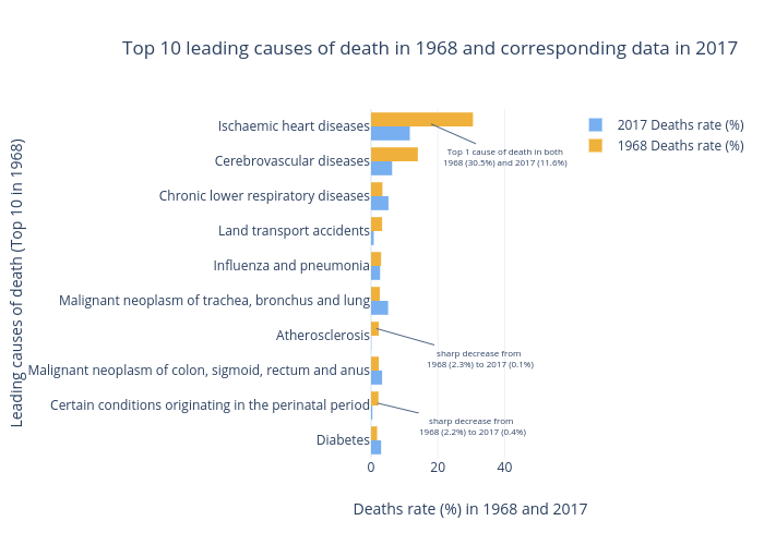
Tclz1995's interactive graph and data of "Top 10 leading causes of death in 1968 and corresponding data in 2017" is a grouped bar chart, showing 2017 Deaths rate (%) vs 1968 Deaths rate (%); with Deaths rate (%) in 1968 and 2017 in the x-axis and Leading causes of death (Top 10 in 1968) in the y-axis.. The x-axis shows values from 0 to 32.10526315789474. The y-axis shows values from -0.9152919612463986 to 9.5. This visualization has the following annotations: Top 1 cause of death in both1968 (30.5%) and 2017 (11.6%); sharp decrease from 1968 (2.3%) to 2017 (0.1%); sharp decrease from 1968 (2.2%) to 2017 (0.4%)