Edit chart
Loading graph
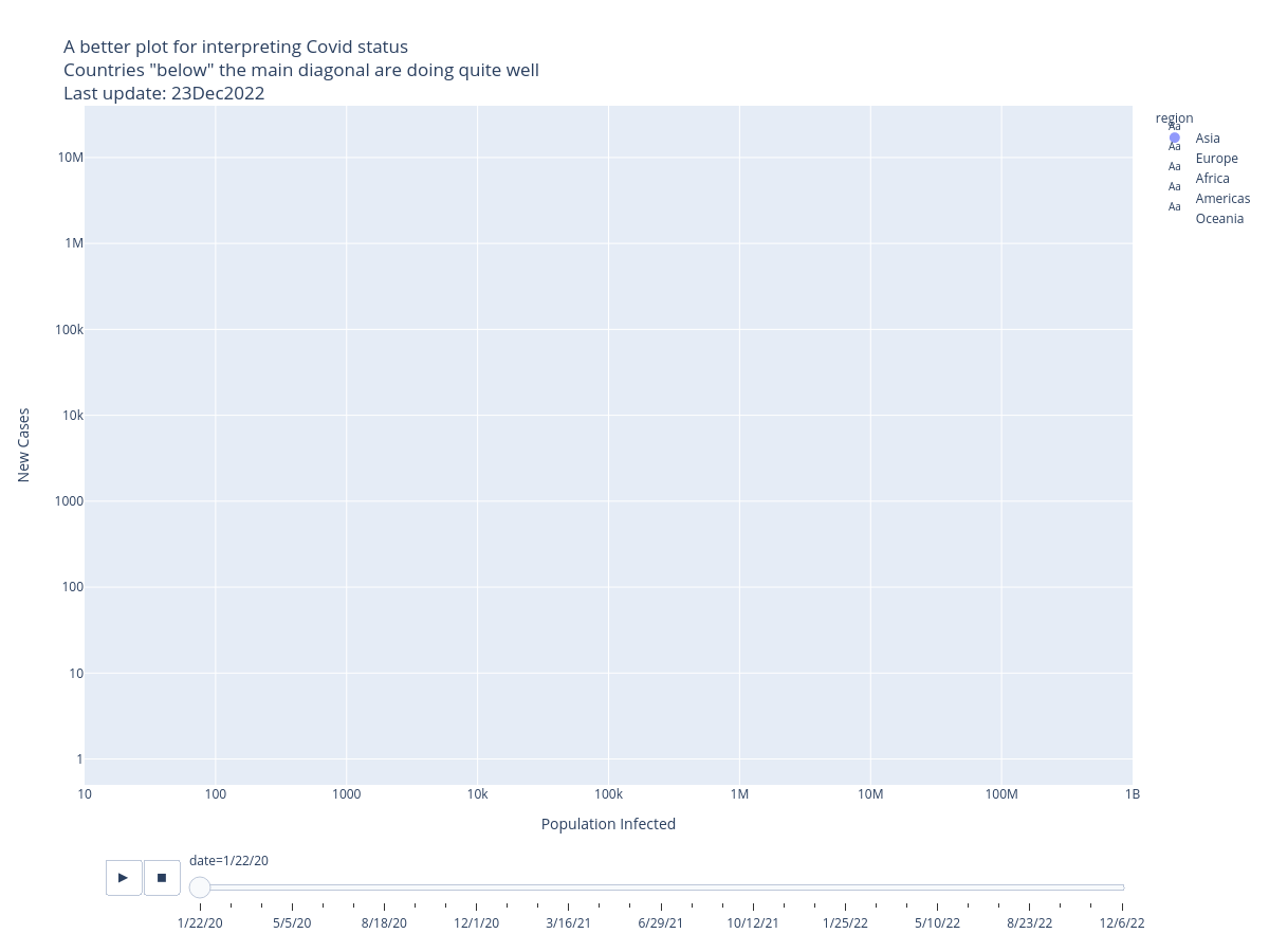
Tclack88's interactive graph and data of "A better plot for interpreting Covid status Countries "below" the main diagonal are doing quite wellLast update: 23Dec2022" is a , showing Asia, Europe, Africa, Americas, Oceania; with Population Infected in the x-axis and New Cases in the y-axis.. The x-axis shows values from 1.0 to 8.999999999999998. The y-axis shows values from -0.30102999566398114 to 7.602059991327962.