Edit chart
Loading graph
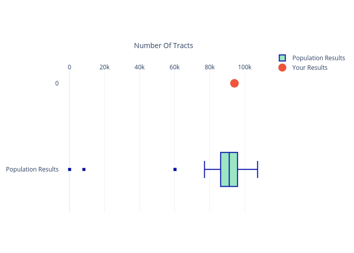
Siyarbahadir's interactive graph and data of "Population Results vs Your Results" is a filled box plot, showing Population Results vs Your Results; with Number Of Tracts in the x-axis. The x-axis shows values from -5907.888888888889 to 113289.88888888889. The y-axis shows values from -0.5 to 1.1533599467731204.