Edit chart
Loading graph
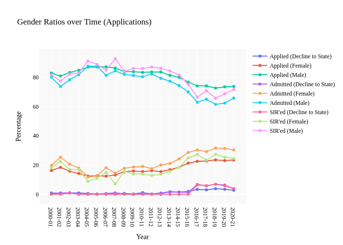
Shomil's interactive graph and data of "Gender Ratios over Time (Applications)" is a line chart, showing Applied (Decline to State), Applied (Female), Applied (Male), Admitted (Decline to State), Admitted (Female), Admitted (Male), SIR'ed (Decline to State), SIR'ed (Female), SIR'ed (Male); with Year in the x-axis and Percentage in the y-axis.. The x-axis shows values from 0 to 0. The y-axis shows values from 0 to 0.