Edit chart
Loading graph
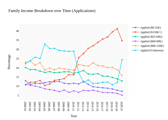
Shomil's interactive graph and data of "Family Income Breakdown over Time (Applications)" is a line chart, showing Applied ($0-25K), Applied ($150K+), Applied ($25-60K), Applied ($60-80K), Applied ($80-150K), Applied (Unknown); with Year in the x-axis and Percentage in the y-axis.. The x-axis shows values from 0 to 0. The y-axis shows values from 0 to 0.