Edit chart
Loading graph
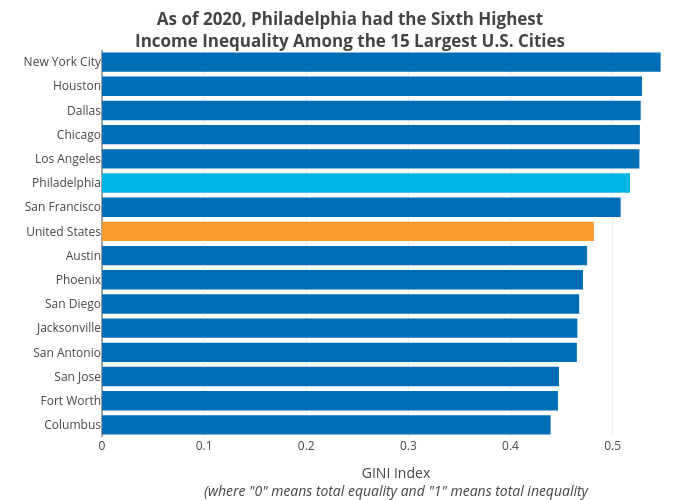
Shields.mi417's interactive graph and data of "As of 2020, Philadelphia had the Sixth HighestIncome Inequality Among the 15 Largest U.S. Cities" is a bar chart, showing Philly, Top 15 City, U.S.; with GINI Index(where "0" means total equality and "1" means total inequality in the x-axis. The x-axis shows values from 0 to 0. The y-axis shows values from 0 to 0.