Edit chart
Loading graph
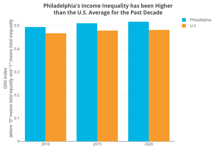
Shields.mi417's interactive graph and data of "Philadelphia's Income Inequality has been Higherthan the U.S. Average for the Past Decade" is a grouped bar chart, showing Philadelphia vs U.S.; with GINI Index(where "0" means total equality and "1" means total inequality in the y-axis. The x-axis shows values from 0 to 0. The y-axis shows values from 0 to 0.