Edit chart
Loading graph
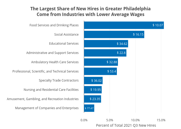
Shields.mi417's interactive graph and data of "The Largest Share of New Hires in Greater PhiladelphiaCome from Industries with Lower Average Wages" is a bar chart; with Percent of Total 2021 Q3 New Hires in the x-axis. The x-axis shows values from 0 to 0. The y-axis shows values from 0 to 0.