Edit chart
Loading graph
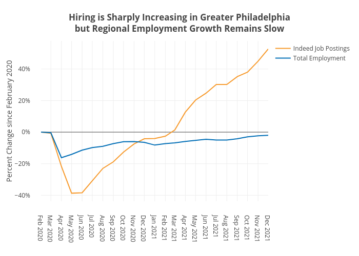
Shields.mi417's interactive graph and data of "Hiring is Sharply Increasing in Greater Philadelphiabut Regional Employment Growth Remains Slow" is a line chart, showing Indeed Job Postings vs Total Employment; with Percent Change since February 2020 in the y-axis. The x-axis shows values from 0 to 0. The y-axis shows values from 0 to 0.