Edit chart
Loading graph
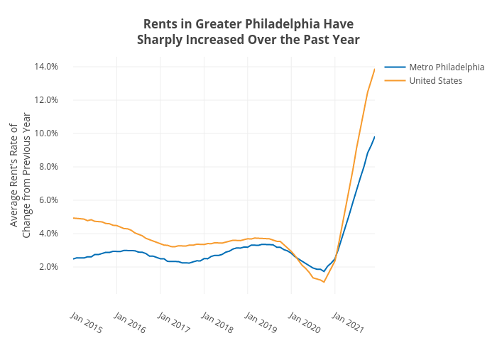
Shields.mi417's interactive graph and data of "Rents in Greater Philadelphia HaveSharply Increased Over the Past Year" is a line chart, showing Metro Philadelphia vs United States; with Average Rent's Rate ofChange from Previous Year in the y-axis. The x-axis shows values from 0 to 0. The y-axis shows values from 0 to 0.