Edit chart
Loading graph
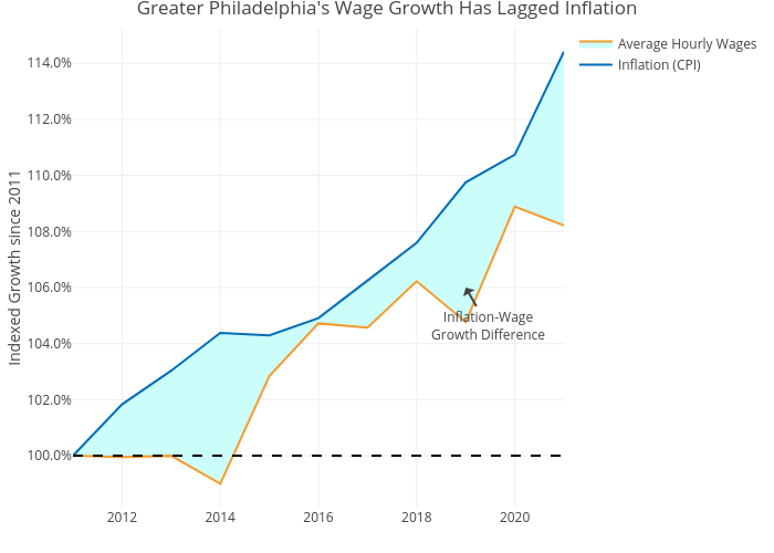
Shields.mi417's interactive graph and data of "Greater Philadelphia's Wage Growth Has Lagged Inflation" is a line chart, showing Inflation (CPI) vs Average Hourly Wages; with Indexed Growth since 2011 in the y-axis. The x-axis shows values from 0 to 0. The y-axis shows values from 0 to 0. This visualization has the following annotation: Inflation-WageGrowth Difference