Edit chart
Loading graph
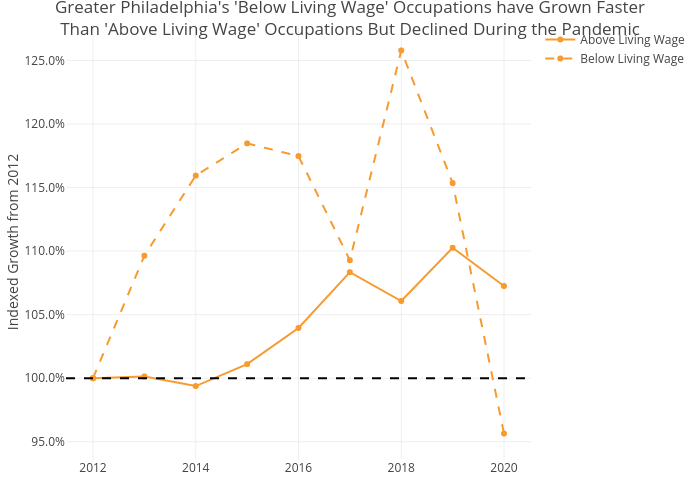
Shields.mi417's interactive graph and data of "Greater Philadelphia's 'Below Living Wage' Occupations have Grown FasterThan 'Above Living Wage' Occupations But Declined During the Pandemic" is a line chart, showing Above Living Wage vs Below Living Wage; with Indexed Growth from 2012 in the y-axis. The x-axis shows values from 0 to 0. The y-axis shows values from 0 to 0.