Edit chart
Loading graph
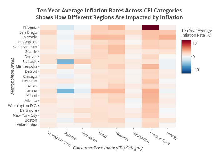
Shields.mi417's interactive graph and data of "Ten Year Average Inflation Rates Across CPI CategoriesShows How Different Regions Are Impacted by Inflation" is a heatmap; with Consumer Price Index (CPI) Category in the x-axis and Metropolitan Areas in the y-axis.. The x-axis shows values from 0 to 0. The y-axis shows values from 0 to 0.