Edit chart
Loading graph
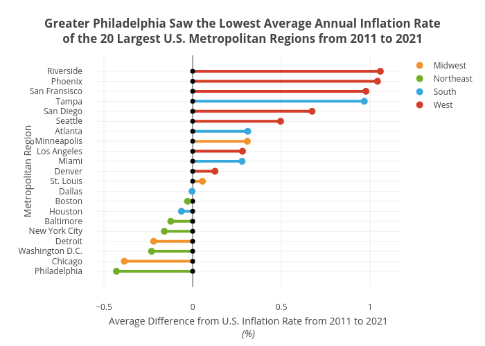
Shields.mi417's interactive graph and data of "Greater Philadelphia Saw the Lowest Average Annual Inflation Rateof the 20 Largest U.S. Metropolitan Regions from 2011 to 2021" is a line chart, showing Midwest, Northeast, South, West, Midwest, Northeast, South, West; with Average Difference from U.S. Inflation Rate from 2011 to 2021(%) in the x-axis and Metropolitan Region in the y-axis.. The x-axis shows values from 0 to 0. The y-axis shows values from 0 to 0.