Edit chart
Loading graph
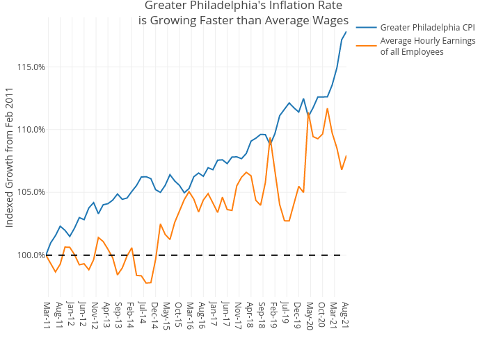
Shields.mi417's interactive graph and data of "Greater Philadelphia's Inflation Rateis Growing Faster than Average Wages" is a line chart, showing Greater Philadelphia CPI vs Average Hourly Earningsof all Employees; with Indexed Growth from Feb 2011 in the y-axis. The x-axis shows values from 0 to 0. The y-axis shows values from 0 to 0.