Edit chart
Loading graph
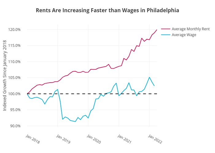
Shields.mi417's interactive graph and data of "Rents Are Increasing Faster than Wages in Philadelphia" is a line chart, showing Average Monthly Rent vs Average Wage; with Indexed Growth Since January 2018 in the y-axis. The x-axis shows values from 0 to 0. The y-axis shows values from 0 to 0.