Edit chart
Loading graph
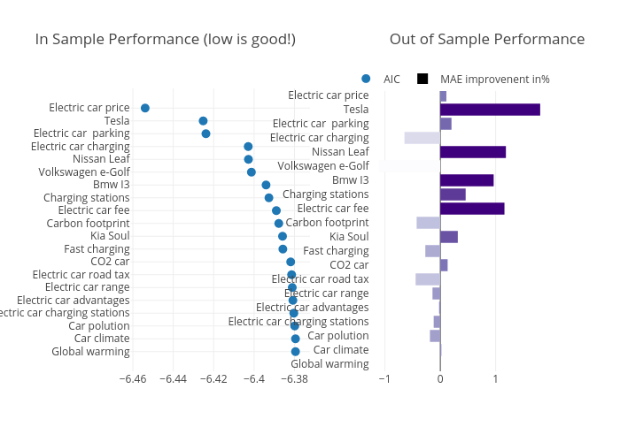
Shasha.jiang's interactive graph and data of "In Sample Performance (low is good!) Out of Sample Performance" is a scatter chart, showing AIC vs MAE improvenent in%. The x-axis shows values from -6.460423461671011 to -6.3730164653289885. The y-axis shows values from -3.3422876949740035 to 22.342287694974004.