Edit chart
Loading graph
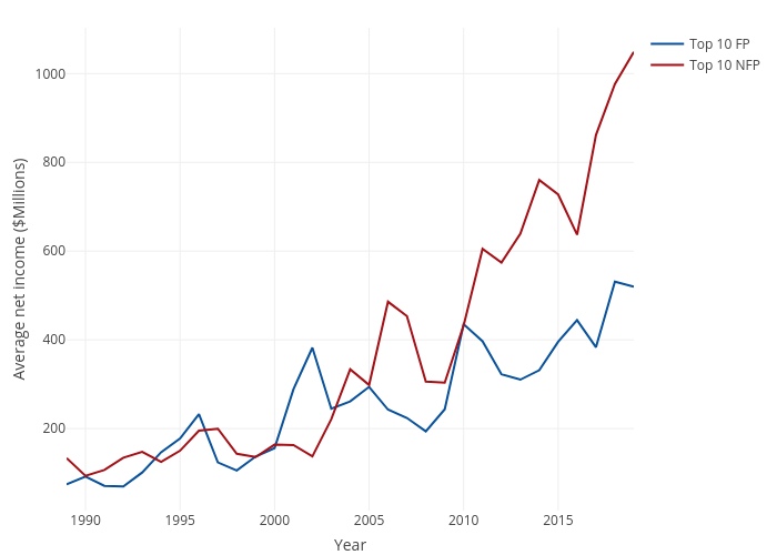
Sgorsky's interactive graph and data of "Average net income ($Millions) vs Year" is a line chart, showing Top 10 FP vs Top 10 NFP; with Year in the x-axis and Average net income ($Millions) in the y-axis.. The x-axis shows values from 0 to 0. The y-axis shows values from 0 to 0.