Edit chart
Loading graph
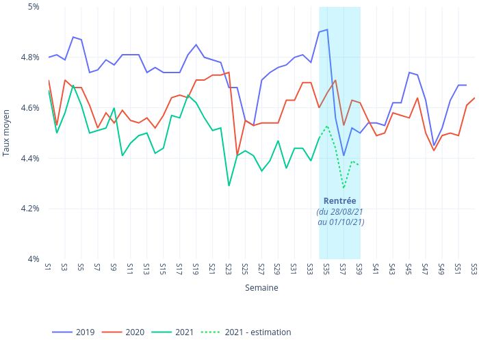
Sergiomonteiro's interactive graph and data of "Taux moyen vs Semaine" is a line chart, showing %{meta.columnNames.y}, %{meta.columnNames.y}, %{meta.columnNames.y}, %{meta.columnNames.y}, %{meta.columnNames.y}; with Semaine in the x-axis and Taux moyen in the y-axis.. The x-axis shows values from 0 to 52. The y-axis shows values from 4 to 5. This visualization has the following annotation: Rentrée(du 28/08/21 au 01/10/21)