Edit chart
Loading graph
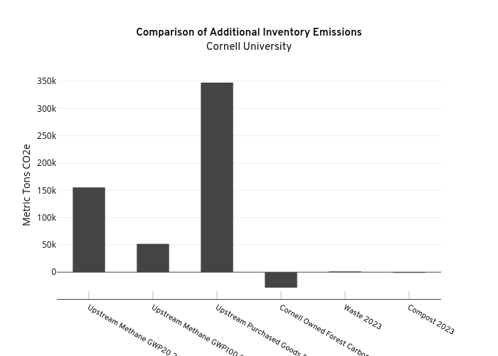
Seb382's interactive graph and data of "Comparison of Additional Inventory EmissionsCornell University" is a bar chart, showing Emission Categories; with {'font': {'family': 'Overpass'}} in the x-axis and Metric Tons CO2e in the y-axis.. The x-axis shows values from -0.5 to 5.5. The y-axis shows values from -49318.5 to 368431.5.