Edit chart
Loading graph
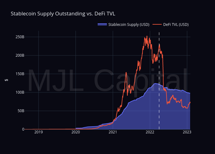
Sean_mjl's interactive graph and data of "Stablecoin Supply Outstanding vs. DeFi TVL" is a filled line chart, showing Stablecoin Supply (USD) vs DeFi TVL (USD); with $ in the y-axis. The x-axis shows values from 0 to 0. The y-axis shows values from 0 to 0. This visualization has the following annotation: MJL Capital