Edit chart
Loading graph
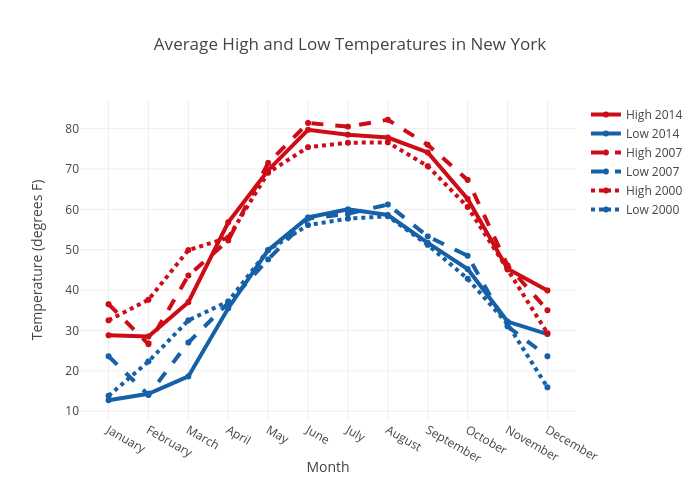
Scalis's interactive graph and data of "Average High and Low Temperatures in New York" is a scatter chart, showing High 2014, Low 2014, High 2007, Low 2007, High 2000, Low 2000; with Month in the x-axis and Temperature (degrees F) in the y-axis.. The x-axis shows values from 0 to 0. The y-axis shows values from 0 to 0.