Edit chart
Loading graph
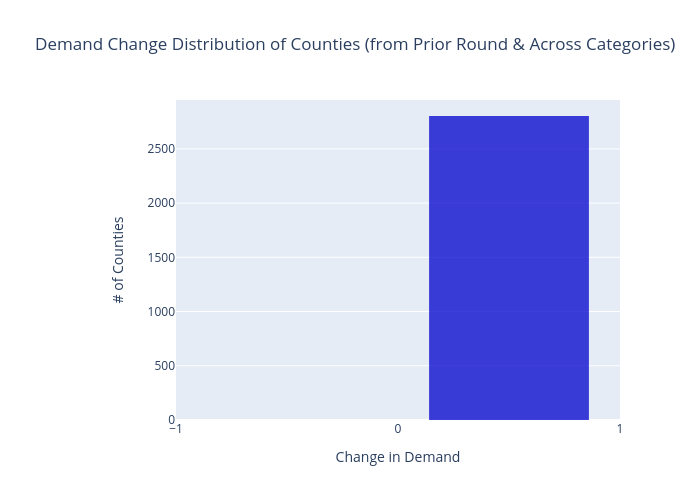
Sashajavid's interactive graph and data of "Demand Change Distribution of Counties (from Prior Round & Across Categories)" is a histogram, showing Counties; with Change in Demand in the x-axis and # of Counties in the y-axis.. The x-axis shows values from 0 to 0. The y-axis shows values from 0 to 0.