Edit chart
Loading graph
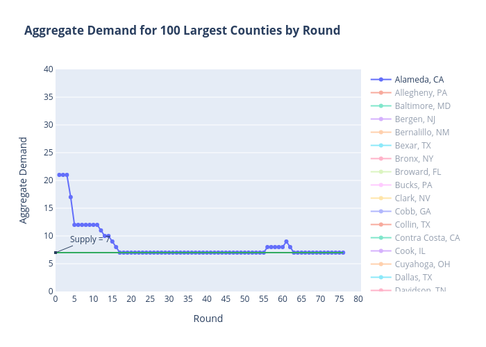
Sashajavid's interactive graph and data of "Aggregate Demand for 100 Largest Counties by Round" is a line chart, showing Alameda, CA, Allegheny, PA, Baltimore, MD, Bergen, NJ, Bernalillo, NM, Bexar, TX, Bronx, NY, Broward, FL, Bucks, PA, Clark, NV, Cobb, GA, Collin, TX, Contra Costa, CA, Cook, IL, Cuyahoga, OH, Dallas, TX, Davidson, TN, DeKalb, GA, Denton, TX, DuPage, IL, Duval, FL, El Paso, CO, El Paso, TX, Erie, NY, Essex, MA, Essex, NJ, Fairfax, VA, Fairfield, CT, Franklin, OH, Fresno, CA, Fulton, GA, Gwinnett, GA, Hamilton, OH, Harris, TX, Hartford, CT, Hennepin, MN, Hidalgo, TX, Hillsborough, FL, Honolulu, HI, Hudson, NJ, Jackson, MO, Jefferson, AL, Jefferson, KY, Kern, CA, King, WA, Kings, NY, Lake, IL, Los Angeles, CA, Macomb, MI, Maricopa, AZ, Marion, IN, Mecklenburg, NC, Miami-Dade, FL, Middlesex, MA, Middlesex, NJ, Milwaukee, WI, Monmouth, NJ, Monroe, NY, Montgomery, MD, Montgomery, PA, Multnomah, OR, Nassau, NY, New Haven, CT, New York, NY, Norfolk, MA, Oakland, MI, Oklahoma, OK, Orange, CA, Orange, FL, Palm Beach, FL, Philadelphia, PA, Pierce, WA, Pima, AZ, Pinellas, FL, Prince George's, MD, Providence, RI, Queens, NY, Riverside, CA, Sacramento, CA, Salt Lake, UT, San Bernardino, CA, San Diego, CA, San Francisco, CA, San Joaquin, CA, San Mateo, CA, Santa Clara, CA, Shelby, TN, Snohomish, WA, St. Louis, MO, Suffolk, MA, Suffolk, NY, Tarrant, TX, Travis, TX, Ventura, CA, Wake, NC, Wayne, MI, Westchester, NY, Will, IL, Worcester, MA; with Round in the x-axis and Aggregate Demand in the y-axis.. The x-axis shows values from 0 to 0. The y-axis shows values from 0 to 40. This visualization has the following annotation: Supply = 7