Edit chart
Loading graph
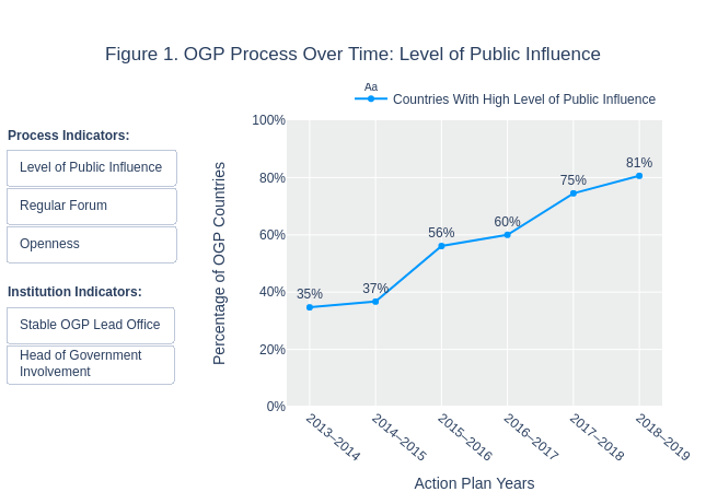
Rfalla's interactive graph and data of "Figure 1. OGP Process Over Time: Level of Public Influence" is a , showing Countries With High Level of Public Influence; with Action Plan Years in the x-axis and Percentage of OGP Countries in the y-axis.. The x-axis shows values from 0 to 0. The y-axis shows values from 0 to 1. This visualization has the following annotations: Process Indicators:; Institution Indicators: