Edit chart
Loading graph
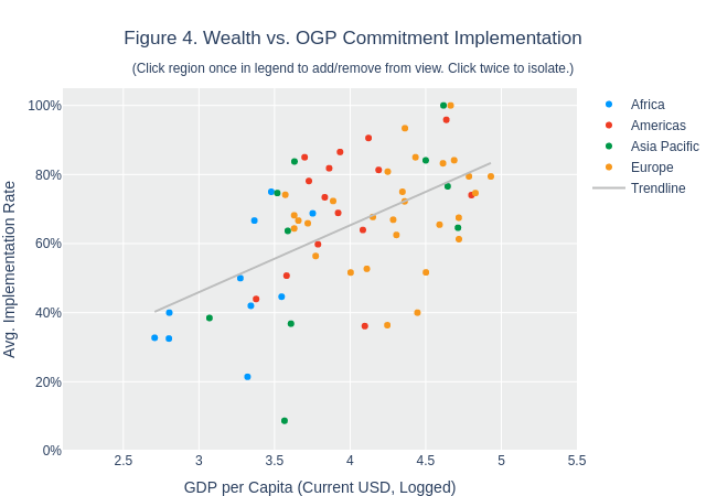
Rfalla's interactive graph and data of "Figure 4. Wealth vs. OGP Commitment Implementation(Click region once in legend to add/remove from view. Click twice to isolate.)" is a scatter chart, showing Africa, Americas, Asia Pacific, Europe, Trendline; with GDP per Capita (Current USD, Logged) in the x-axis and Avg. Implementation Rate in the y-axis.. The x-axis shows values from 2.1 to 5.5. The y-axis shows values from 0 to 1.05.