Edit chart
Loading graph
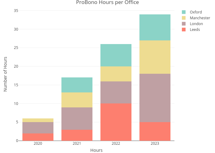
Paulam's interactive graph and data of "ProBono Hours per Office" is a stacked bar chart, showing Leeds, London, Manchester, Oxford; with Hours in the x-axis and Number of Hours in the y-axis.. The x-axis shows values from 0 to 0. The y-axis shows values from 0 to 0.