Edit chart
Loading graph
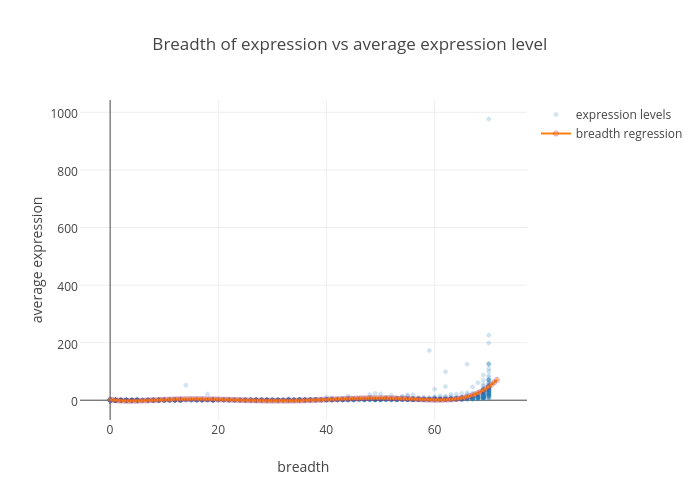
Oxana's interactive graph and data of "Breadth of expression vs average expression level" is a scatter chart, showing expression levels vs breadth regression; with breadth in the x-axis and average expression in the y-axis.. The x-axis shows values from 0 to 0. The y-axis shows values from 0 to 0.