Edit chart
Loading graph
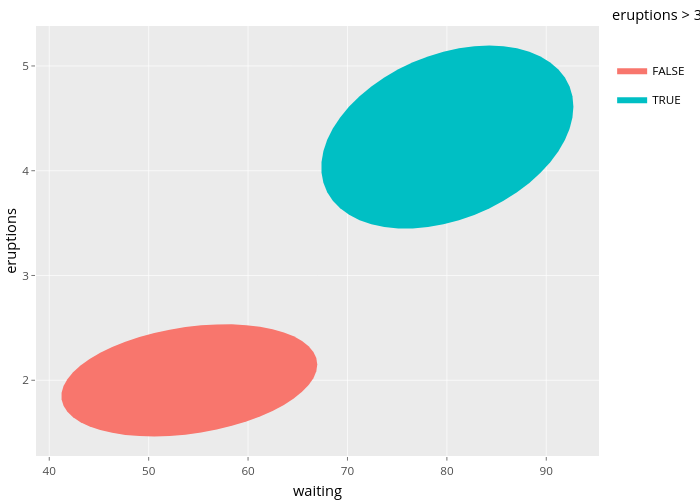
Nadhil's interactive graph and data of "eruptions vs waiting" is a filled line chart, showing FALSE vs TRUE; with waiting in the x-axis and eruptions in the y-axis.. The x-axis shows values from 38.6669170373042 to 95.3029977956258. The y-axis shows values from 1.27687521538116 to 5.38148161320564. This visualization has the following annotation: eruptions > 3