Edit chart
Loading graph
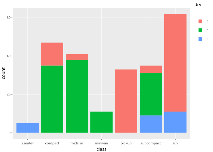
Nadhil's interactive graph and data of "count vs class" is a , showing 4, f, r; with class in the x-axis and count in the y-axis.. The x-axis shows values from 0.4 to 7.6. The y-axis shows values from -3.1 to 65.1. This visualization has the following annotation: drv