Edit chart
Loading graph
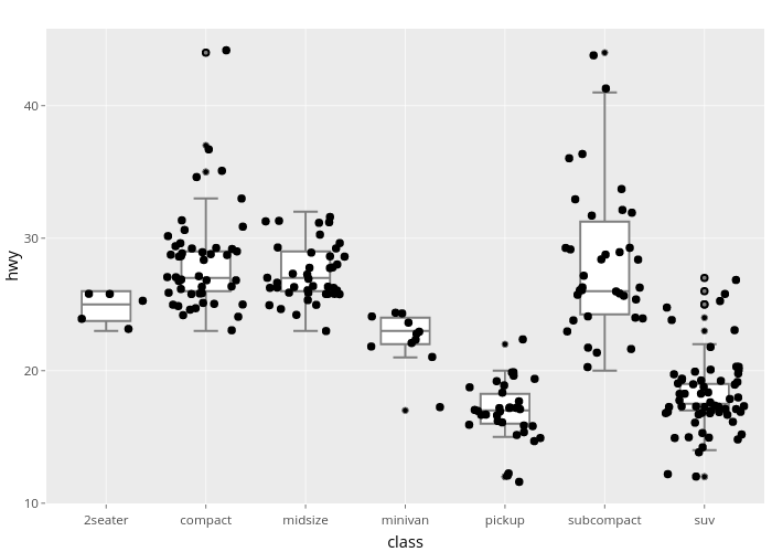
Nadhil's interactive graph and data of "hwy vs class" is a box plot; with class in the x-axis and hwy in the y-axis.. The x-axis shows values from 0.4 to 7.6. The y-axis shows values from 9.98383604687639 to 45.8091566319671.