Edit chart
Loading graph
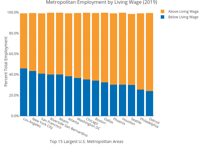
Mshields417's interactive graph and data of "Metropolitan Employment by Living Wage (2019)" is a stacked bar chart, showing Below Living Wage vs Above Living Wage; with Top 15 Largest U.S. Metropolitan Areas in the x-axis and Percent Total Employment in the y-axis.. The x-axis shows values from 0 to 0. The y-axis shows values from 0 to 0.