Edit chart
Loading graph
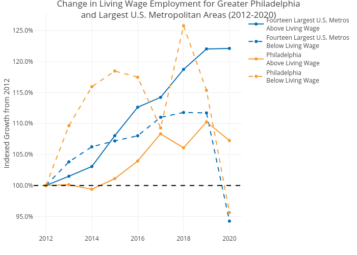
Mshields417's interactive graph and data of "Change in Living Wage Employment for Greater Philadelphiaand Largest U.S. Metropolitan Areas (2012-2020)" is a line chart, showing Fourteen Largest U.S. MetrosAbove Living Wage, Fourteen Largest U.S. MetrosBelow Living Wage, PhiladelphiaAbove Living Wage, PhiladelphiaBelow Living Wage; with Indexed Growth from 2012 in the y-axis. The x-axis shows values from 0 to 0. The y-axis shows values from 0 to 0.