Edit chart
Loading graph
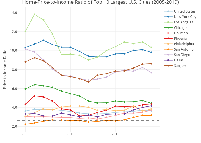
Mshields417's interactive graph and data of "Home-Price-to-Income Ratio of Top 10 Largest U.S. Cities (2005-2019)" is a line chart, showing United States, New York City, Los Angeles, Chicago, Houston, Phoenix, Philadelphia, San Antonio, San Diego, Dallas, San Jose; with Price to Income Ratio in the y-axis. The x-axis shows values from 0 to 0. The y-axis shows values from 0 to 0.