Edit chart
Loading graph
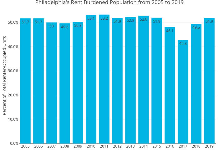
Mshields417's interactive graph and data of "Philadelphia's Rent Burdened Population from 2005 to 2019" is a bar chart; with Percent of Total Renter-Occupied Units in the y-axis. The x-axis shows values from 0 to 0. The y-axis shows values from 0 to 0.