Edit chart
Loading graph
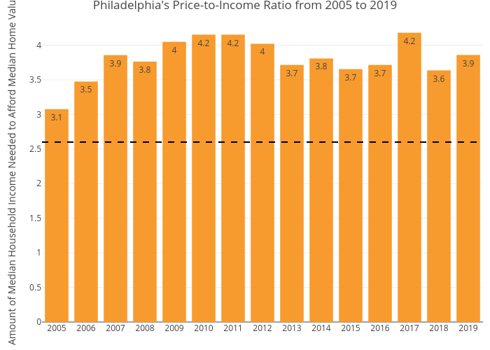
Mshields417's interactive graph and data of "Philadelphia's Price-to-Income Ratio from 2005 to 2019" is a bar chart; with Amount of Median Household Income Needed to Afford Median Home Value in the y-axis. The x-axis shows values from 0 to 0. The y-axis shows values from 0 to 0.