Edit chart
Loading graph
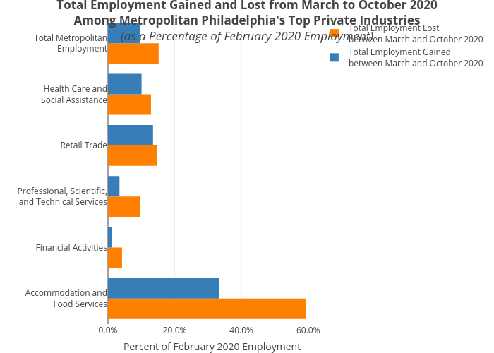
Mshields417's interactive graph and data of "Total Employment Gained and Lost from March to October 2020Among Metropolitan Philadelphia's Top Private Industries(as a Percentage of February 2020 Employment)" is a grouped bar chart, showing Total Employment Lostbetween March and October 2020 vs Total Employment Gainedbetween March and October 2020; with Percent of February 2020 Employment in the x-axis. The x-axis shows values from 0 to 0. The y-axis shows values from 0 to 0.