Edit chart
Loading graph
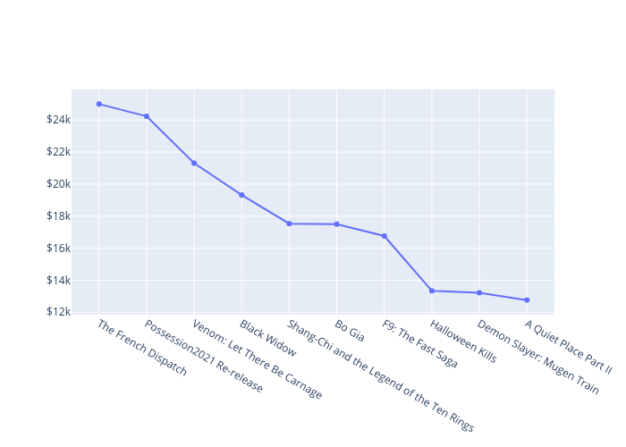
Miguel2f's interactive graph and data of "Best Per-Theater Averages in Pandemic" is a scatter chart, showing Best Per-Theater Averages in Pandemic. The x-axis shows values from 0 to 0. The y-axis shows values from 0 to 0.