Edit chart
Loading graph
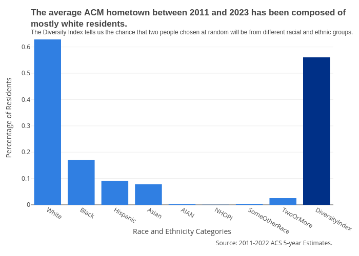
Melissajuarezc's interactive graph and data of "The average ACM hometown between 2011 and 2023 has been composed ofmostly white residents.The Diversity Index tells us the chance that two people chosen at random will be from different racial and ethnic groups." is a bar chart; with Race and Ethnicity Categories in the x-axis and Percentage of Residents in the y-axis.. The x-axis shows values from 0 to 0. The y-axis shows values from 0 to 0. This visualization has the following annotation: Source: 2011-2022 ACS 5-year Estimates.