Edit chart
Loading graph
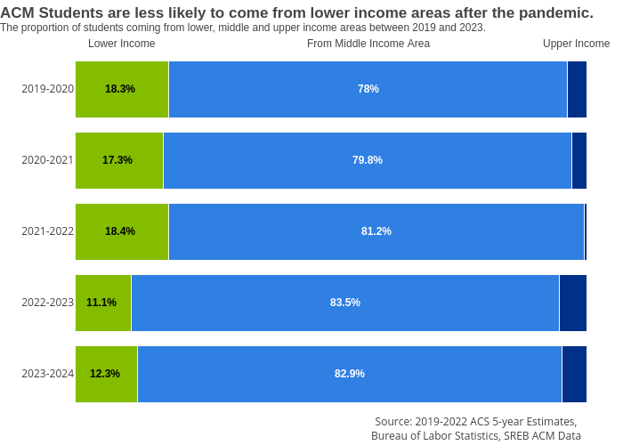
Melissajuarezc's interactive graph and data of "ACM Students are less likely to come from lower income areas after the pandemic.The proportion of students coming from lower, middle and upper income areas between 2019 and 2023." is a stacked bar chart, showing Low Income, Middle Income, Upper Income. The x-axis shows values from 0 to 0. The y-axis shows values from 0 to 0. This visualization has the following annotations: Lower Income; From Middle Income Area; Upper Income; 18.3% ; 17.3% ; 18.4% ; 11.1% ; 12.3% ; 78%; 79.8%; 81.2%; 83.5%; 82.9%; Source: 2019-2022 ACS 5-year Estimates,Bureau of Labor Statistics, SREB ACM Data