Edit chart
Loading graph
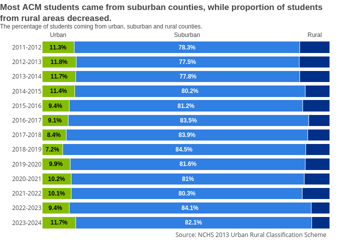
Melissajuarezc's interactive graph and data of "Most ACM students came from suburban counties, while proportion of studentsfrom rural areas decreased.The percentage of students coming from urban, suburban and rural counties." is a stacked bar chart, showing Urban, Suburban, Rural. The x-axis shows values from 0 to 0. The y-axis shows values from 0 to 0. This visualization has the following annotations: Urban; Suburban; Rural; Source: NCHS 2013 Urban Rural Classification Scheme; 11.3%; 11.8%; 11.7%; 11.4%; 9.4%; 9.1%; 8.4%; 7.2%; 9.9%; 10.2%; 10.1%; 9.4%; 11.7%; 78.3%; 77.5%; 77.8%; 80.2%; 81.2%; 83.5%; 83.9%; 84.5%; 81.6%; 81%; 80.3%; 84.1%; 82.1%