Edit chart
Loading graph
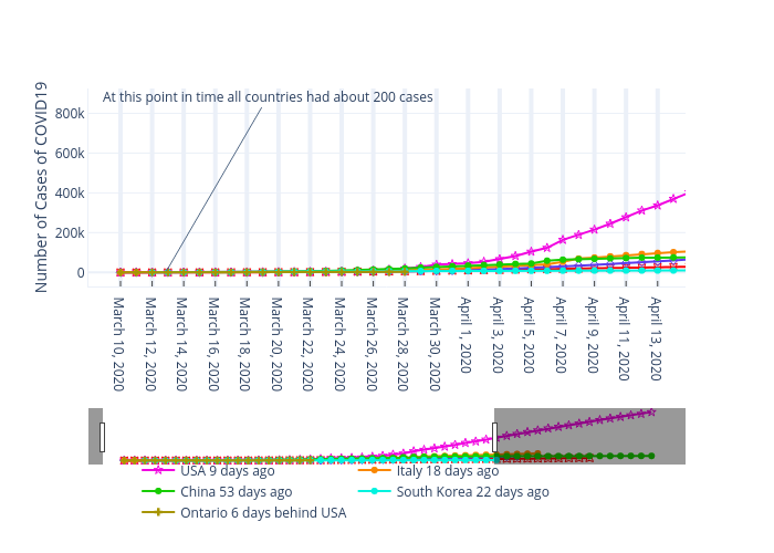
Mdnelson's interactive graph and data of "" is a , showing Canada, %{meta.columnNames.y}, USA 9 days ago, Italy 18 days ago, %{meta.columnNames.y}, %{meta.columnNames.y}, %{meta.columnNames.y}; with in the x-axis and Number of Cases of COVID19 in the y-axis.. The x-axis shows values from -2.0303042511454503 to 35.7660472972973. The y-axis shows values from -84548.515625 to 938933.515625. This visualization has the following annotation: At this point in time all countries had about 200 cases