Edit chart
Loading graph
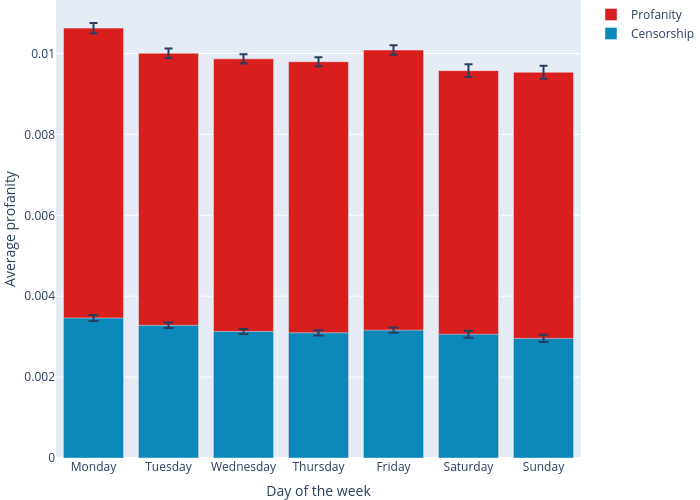
Mculyak's interactive graph and data of "" is a overlaid bar chart, showing Profanity vs Censorship; with Day of the week in the x-axis and Average profanity in the y-axis.. The x-axis shows values from -0.5 to 6.5. The y-axis shows values from 0 to 0.011322655111323217.