Edit chart
Loading graph
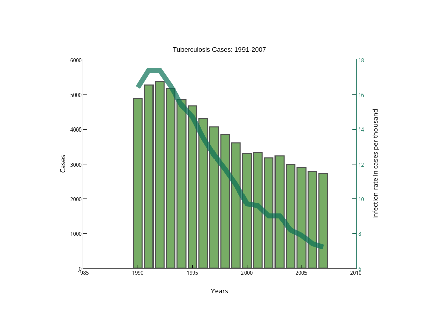
Matlab_user_guide's interactive graph and data of "Cases vs Years" is a line chart, showing Infection Rate vs Cases; with Years in the x-axis and Cases in the y-axis.. The x-axis shows values from 1985.0 to 2010.0. The y-axis shows values from 0.0 to 6000.0. This visualization has the following annotation: Tuberculosis Cases: 1991-2007