Edit chart
Loading graph
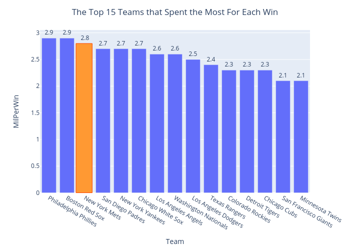
Mancusom33's interactive graph and data of "The Top 15 Teams that Spent the Most For Each Win" is a bar chart; with Team in the x-axis and MilPerWin in the y-axis.. The x-axis shows values from 0 to 0. The y-axis shows values from 0 to 0.