Edit chart
Loading graph
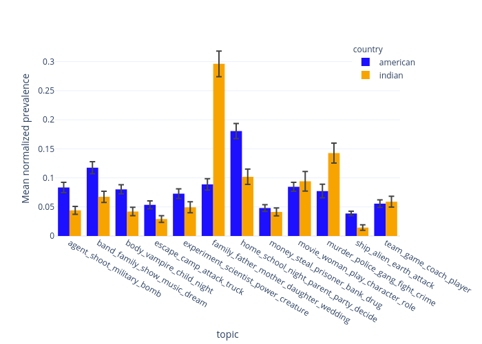
Lgburget's interactive graph and data of "Mean normalized prevalence vs topic" is a grouped bar chart, showing american vs indian; with topic in the x-axis and Mean normalized prevalence in the y-axis.. The x-axis shows values from 9.5 to 21.5. The y-axis shows values from 0 to 0.3350499867798818.