Edit chart
Loading graph
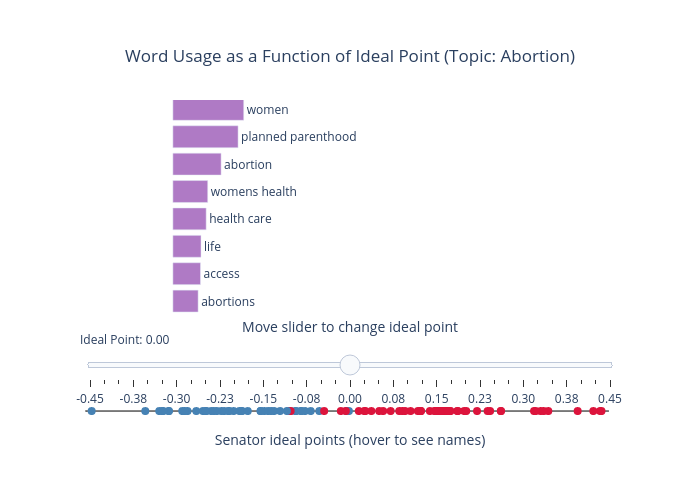
Keyonvafa's interactive graph and data of "Word Usage as a Function of Ideal Point (Topic: Abortion)" is a scatter chart; with Senator ideal points (hover to see names) in the x-axis. The x-axis shows values from -0.46 to 0.47000000000000003. The y-axis shows values from -0.6 to 1.9. This visualization has the following annotation: Move slider to change ideal point