Edit chart
Loading graph
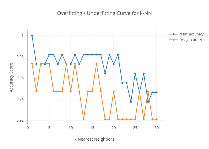
Kecbenson's interactive graph and data of "Overfitting / Underfitting Curve for k-NN" is a line chart, showing train_accuracy vs test_accuracy; with k Nearest Neighbors in the x-axis and Accuracy Score in the y-axis.. The x-axis shows values from 0 to 0. The y-axis shows values from 0 to 0.