Edit chart
Loading graph
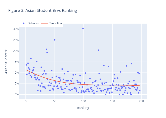
Jzlee's interactive graph and data of "Figure 3: Asian Student % vs Ranking" is a scatter chart, showing Schools vs Trendline; with Ranking in the x-axis and Asian Student % in the y-axis.. The x-axis shows values from 0 to 0. The y-axis shows values from 0 to 0.